Mastering Website Localisation: A Guide with Real-life Examples

In recent years, many businesses worldwide have been exploring opportunities for international expansion. In this era of globalisation, the concept of ‘localisation’ has become increasingly significant.
Website localisation is the process of optimising content to a specific region or culture. Localising correctly plays a crucial role in ensuring the international success of a company or brand.
This article aims to illustrate the process of website localisation. When companies enter international markets, it’s not just about adjusting policies and service offerings; it also involves tailoring social media content and website designs to align with the local language and marketing preferences. In this article, we will explore the key principles and effective methods of localisation, using real-world case studies as examples.
What is website localisation?
Website localisation is about optimising content and navigation to match the culture and language of a specific target market. The primary objective is to enhance the user experience; supported by data from the CSA Research survey, indicating that 65% of consumers are more inclined to purchase from a website in their native language.
Differences between translation and localisation
Localisation and translation serve different purposes when expanding into new markets. For instance, Asian and European markets each have their unique approaches to customer service, legal requirements, and consumer habits. Overlooking these cultural intricacies during expansion can leave a detrimental impact on the user experience, potentially leading to a negative impression among users. Hence, it is imperative to pay careful attention to these cultural nuances when embarking on expansion efforts.
How to successfully localise a website
Localising a website involves a series of steps to meet the specific needs and cultural factors of the region/country. These steps include:
- Target user and local market research
- Translation work
- Design and layout
- Regional customisation
- SEO (search engine optimisation) and analytics
- Final stage
Target user and local market research
Begin by defining specific demographics, including age, gender, and occupation groups. This lays the foundation for effective service delivery. Depending on your chosen target region or country, identify the content that needs localisation. Determine the budget, schedule, and available resources for content production and customer support.
Translation Work
An important aspect of website localisation is the translation of content into the target language. It is highly reccomended to have translations done by local native speakers, as they can accurately convey local expressions and nuances. Beyond linguistic accuracy, effective localization requires a deep cultural understanding of the target region. This understanding should be informed by custom research, allowing insights into the culture, values, and business practices of the local audience. By gaining this insight, businesses can identify service priorities and specific needs that must be addressed to resonate with the target market.
Design and layout
Depending on the target region, it may be necessary to make adjustments to the website’s design and layout. Some languages may require right-to-left reading formats or specific fonts to ensure readability and cultural alignment. Additionally, it’s important to note that when translating content from languages like Japanese to English, the text may expand considerably. These design considerations are vital for maintaining a seamless user experience across different cultures and languages.
Regional customisation
Customise your website to accommodate legal, regulatory, and cultural differences. This includes adapting payment methods, price labelling, and incorporating essential legal disclaimers. In certain countries, these elements can significantly impact the success compliance of the services offered. Regional customization ensures that the website aligns with local expectations and adheres to legal requirements.
SEO (search engine optimisation) and analytics
To enhance visibility and relevance, optimise your content in line with search trends and keywords within your target regions. Effective SEO boosts the website’s discoverability and ensures that it reaches its intended audience. Analytics tools should be employed to track user behaviour and engagement, providing valuable insights into the website’s performance in the local market.
Final Stages
In the final stages of website localisation, comprehensive user testing and feedback collection are conducted. This involves rigorous testing of the localised website by the target audience to identify any potential issues or areas for improvement. Feedback from local partners and users is invaluable in fine-tuning the website’s functionality and content. Following these adjustments, the website is ready for publication. However, localization doesn’t end here. Continuous monitoring of user behaviour is essential. This ongoing analysis helps identify any additional refinements needed to enhance the overall user experience and ensure the website’s long-term success in the international market.
These comprehensive steps outline the core process of website localization, encompassing all aspects from research and translation to design adjustments, regional customization, and ongoing optimization.
Case Studies: Localised Japanese Websites
Consideration for culture-specific preferences and designs is pivotal for a website’s success. Tailoring the layout of the websit and selecting colors to align with the culture of each country can significantly influence users’ impressions and experiences.
Let’s examine a few examples of Japanese company websites that have been expertly localised to cater to an international audience.
Toyota Motor Corporation
The first successful localisation example is Toyota Motor Corporation. The Japanese and US versions of the website exhibit noticeable design differences.
The Japanese version employs a slideshow-style top image for advertisements and content, while the presentation of vehicles for sale is simple and clear.
On the contrary, the US version focuses on creating visual impact through striking images and employs a more visual strategy to communicate information. This approach is effective in captivating users visually and enhancing the allure of the product or brand.
Sony Corporation
Sony, established in 1964, rapidly expanded in the electronics industry, pioneering groundbreaking products like the transistor radio. This product helped the company to gain a strong reputation overseas, contributing to their nternational success to date.
When navigating the Sony Japan website, users will encounter an array of content banners, with the latest news displayed at the bottom of the page. The Japanese version is informative and includes user-friendly global navigation. Visitors gain a comprehensive view of the site’s content at first glance and can readily access products and other pages.
The Sony UK website features a three-line drawer menu that is optimised for easy readability on small devices like smartphones. It is crucial to tailor the design to accommodate the usage patterns of users and devices specific to each country.
Unlike the Japanese version, the UK website utilises a single photo for the key visual on the top page. In contrast, the Japanese site employs multiple visuals that slide and switch between each other, often highlighting popular products or items of interest in the region.
Furthermore, similar to numerous international websites, the Sony UK website prioritises large images with minimal textual information.
Daikin Industries Ltd.
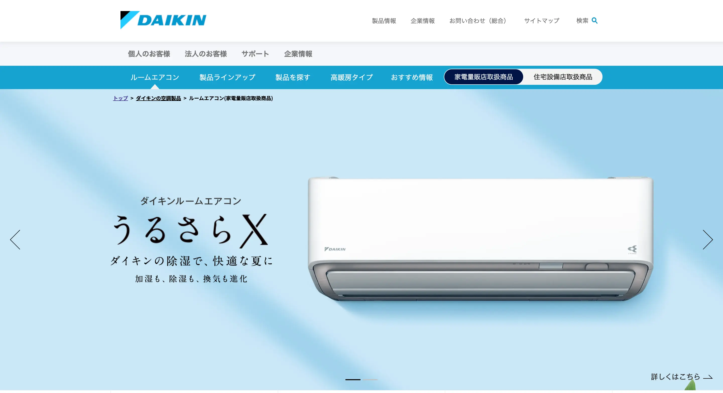
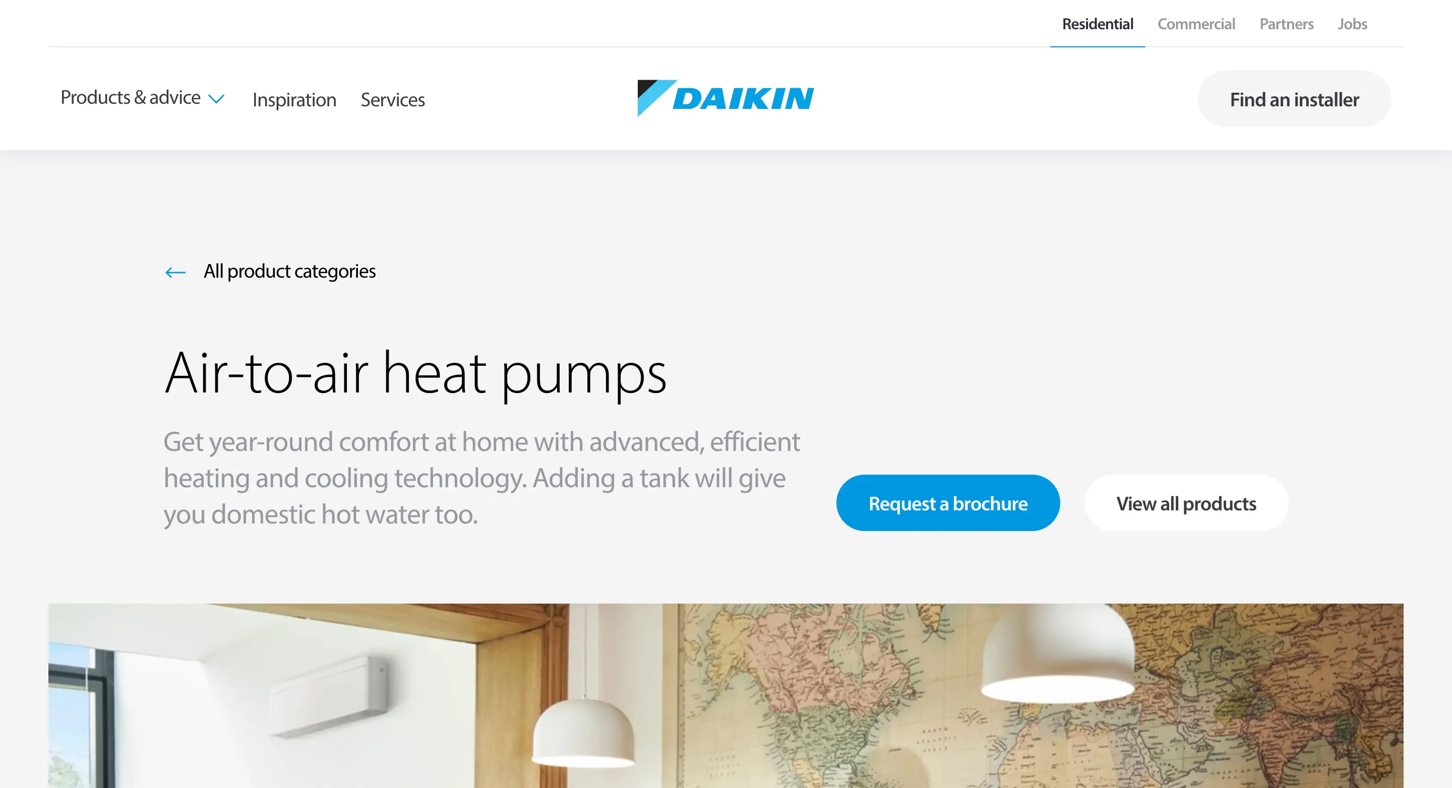
Daikin Industries Ltd. is a leading manufacturer and supplier of heating, ventilation and air conditioning equipment, headquartered in Osaka, Japan. Operating across more than 170 countries, it tailors its design and content to meet the specific demands of each market.
Daikin employs a distinct design strategy for each market. The Japanese site places the product front and center, encouraging users to scroll for more details.

The UK-focused site, in contrast, offers an extensive explanation of the products’ value and benefits, capturing the attention of potential new users. This distinction is driven by the unique market position and name recognition of Daikin in the UK, necessitating a tailored strategy for that specific audience.

Case Studies: Localised Overseas Websites
Here are some examples of website localisation carried out by international companies.
McDonald’s Corporation
McDonald’s, a renowned fast-food chain from the USA, has experienced rapid growth owing to its effective franchise model and management strategy. As it expands globally, the company customises its website to suit regional preferences.
For instance, McDonald’s in Asia has curated a ‘special menu’ that resonates with the local palate. The Japanese version of the website in August 2023 prominently showcases ‘Hawaiian Burgers’ and ‘Samurai Macs’ (their local menus) in an appealing manner.
On the other hand, McDonald’s websites in the USA do not have special regional menus like those in Asia. The website also features a more subdued colour scheme compared to the Japanese website, employing a simpler design primarily dominated by the symbolic colours of McDonald’s: red and yellow.
Additionally, take a look at the Australian website. The initial view showcases a sky photograph adorned with the handwritten words ‘We’re on it.’
The phrase ‘Leave it to (McDonald’s)! Come on if you’re hungry’ follows, immediately stimulating the user’s appetite. The visual presentation of melting cheese from the Australian-exclusive Cheesy Angus and Cheesy Beef menu seems to be a website structure tailored to suit the Australian market.
McDonald’s successful maintenance of a consistent brand image while considering local preferences and culture is indicative of the effectiveness of McDonald’s localization efforts!
Nike Inc.
Nike, a renowned sports brand established in 1964, has expanded globally, offering sports apparel, footwear, and various accessories. Its innovative designs and distinctive marketing strategies have contributed to its widespread popularity. Let’s examine Nike’s websites in various countries.
Take, for instance, the Chinese website. Upon the first view, a membership advertisement featuring a series of photos, illustrations, and QR codes is displayed. This approach aims to promote membership registration while reflecting the energetic and dynamic essence of the NIKE sports brand. It appears to be a deliberate strategy to boost the number of app users at the initial view.
Moreover, app registration via WeChat and other platforms is a common practice in China, likely exerting an additional influence on this choice.
Moving on to the Portuguese website, a notable distinction from the Chinese version is the large-sized promotional video. It showcases various sports scenes, with a significant emphasis on football, which is Portugal’s national sport. This strategic emphasis on football within the imagery is believed to be a deliberate aspect of the localisation process, tailored to resonate with the local audience.
The initial view on the Argentine website predominantly features images of sneakers, specifically the Pegasus 40, a running shoe created to fit everyone. The prominence of the shoe image without accompanying text suggests its popularity within the Argentine market. This instance serves as another notable example of effective website localisation.
Conclusion
Successful website localisation is integral for achieving success in a specific target region. It requires a profound comprehension of the unique characteristics and languages of each area, enabling an enhanced user experience. Consider your website as a direct link to your customers, serving a pivotal role in your business’s continual growth and prosperity through effective communication.
Article: Alina Sai / Hisayoshi Kato
Design: Saya Kobayashi
CATEGORY LIST
-

Explore our diverse website/app designs and other production achievements.
-

Find articles that matter to you on COOSY BLOG!
Talk to Us, We Listen!
Click here for enquiries about websites and quotations.
Contact us


