Share on
Japanese Website Designs vs. the Rest of the World!
In today’s globalised business landscape, companies are increasingly looking to expand their presence into Japan. Creating a website that resonates with the target audience is a pivotal step in this process. However, web design can be significantly influenced by the nuances of design standards, cultural sensibilities, and languages.
So, what exactly sets Japanese web design apart from its Western counterparts, particularly in Europe and the United States? This article aims to shed light on the distinctions between Japanese and overseas web design, offering insights for those curious about these disparities.
Remarkably, websites can undergo substantial transformations when adapted for different countries; to the point where one might argue that they are almost unrecognisable as the same site. These changes encompass everything from cultural nuances to the design components of text presentation and the unique characteristics of the user base.
In the following sections, we will delve into each of these aspects, shedding light on the significance of localisation in web design. By gaining a deeper understanding of the intricacies of Japanese web design, our aim is to provide insight into the rationale behind these adaptations. To facilitate comprehension, we will accompany our explanations with visual examples that illustrate these differences.
|
Please note: This article will primarily focus on websites from the United Kingdom and the United States, which we will refer to as ‘overseas sites’ for the purpose of this discussion. |
Text and Information in Japanese Web Design
One of the key distinctions between Japanese and overseas websites is their approach to text usage. Overseas websites often rely on catchy headlines and concise content, leaving more room for graphics and images. In contrast, Japanese websites tend to have a relatively larger amount of text to provide comprehensive explanations of products and information.
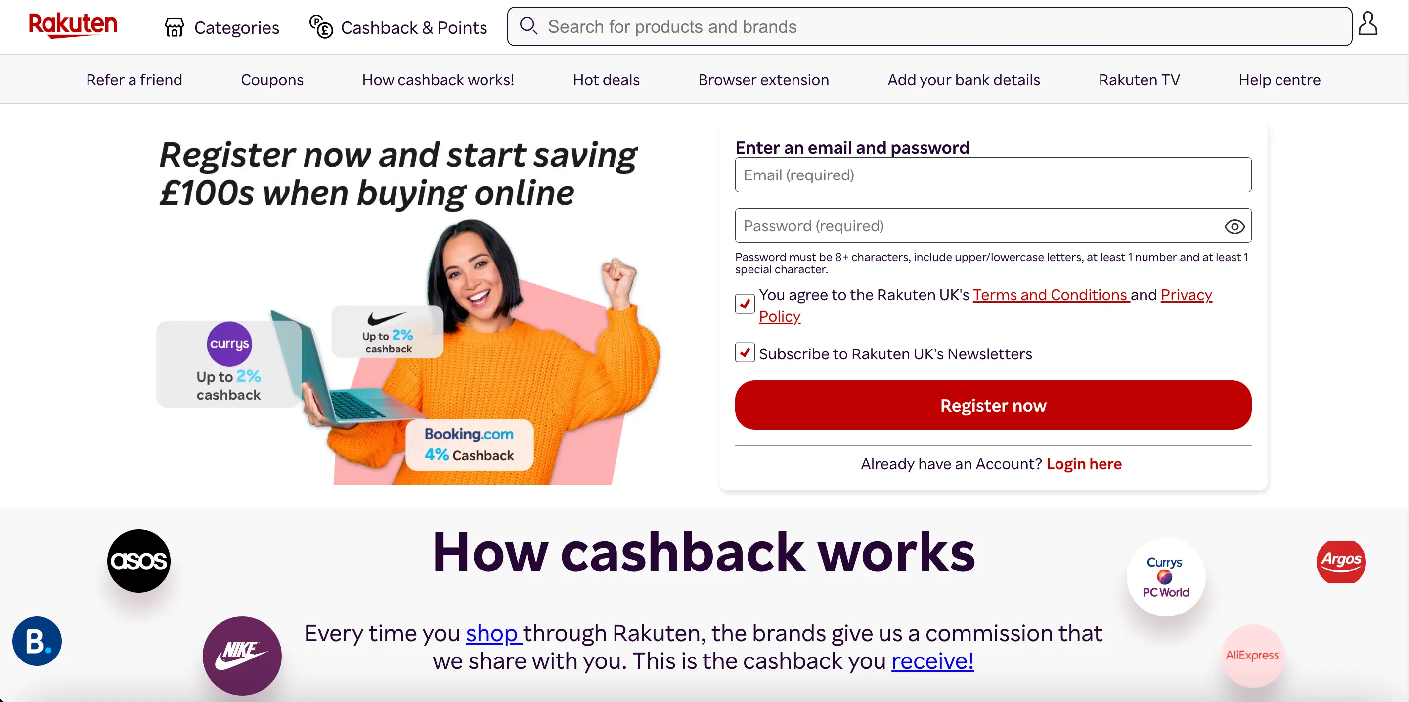
Japan vs UK Website Case Study
To better understand this difference, let’s compare the Japanese and UK versions of the eCommerce platform, Rakuten’s homepage.
Upon visiting the Japanese version, you’ll feel that the product images dominate the page, along with meticulously organised notices and detailed explanations.

In contrast, the UK version features bold typography and italics to emphasise phrases like ‘How cashback works’. This design choice aims to convey the importance of the messages concisely.
The same patterns can also be observed on the two Starbucks websites.
On the Starbucks US website, half of the screen is dedicated to showcasing a featured product. The left side displays the image of a seasonal item along with an advertising slogan, “SUMMER WINS DAYS” in bold lettering, and the right side notifying a ‘25% discount for members’ in this case.
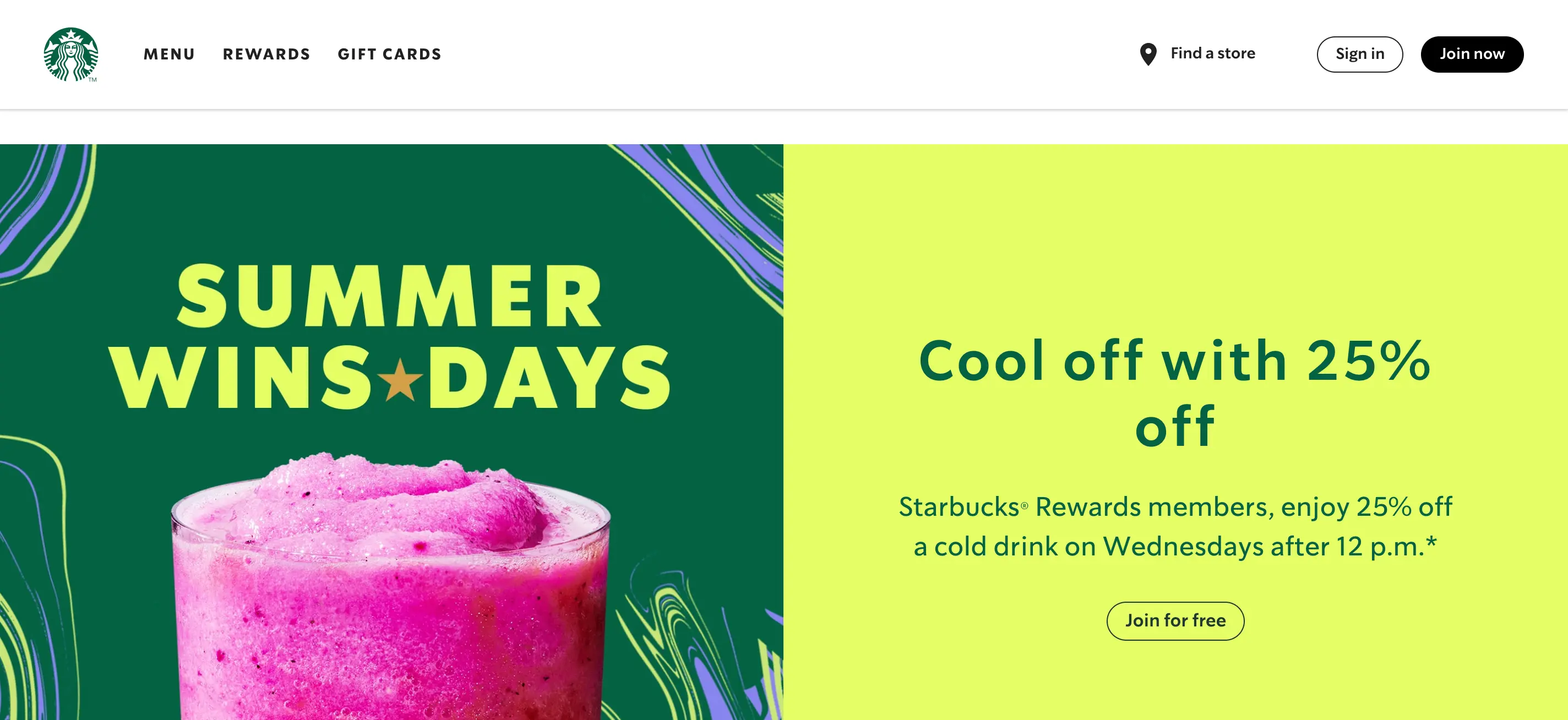
On the Japanese version, you’ll find three featured products. Japanese consumers typically seek detailed information when considering a purchase. Therefore, it is more important for companies to communicate the reasons to buy a product concisely. In the image below, you can see how densely packed the layout is, compared to the American version.
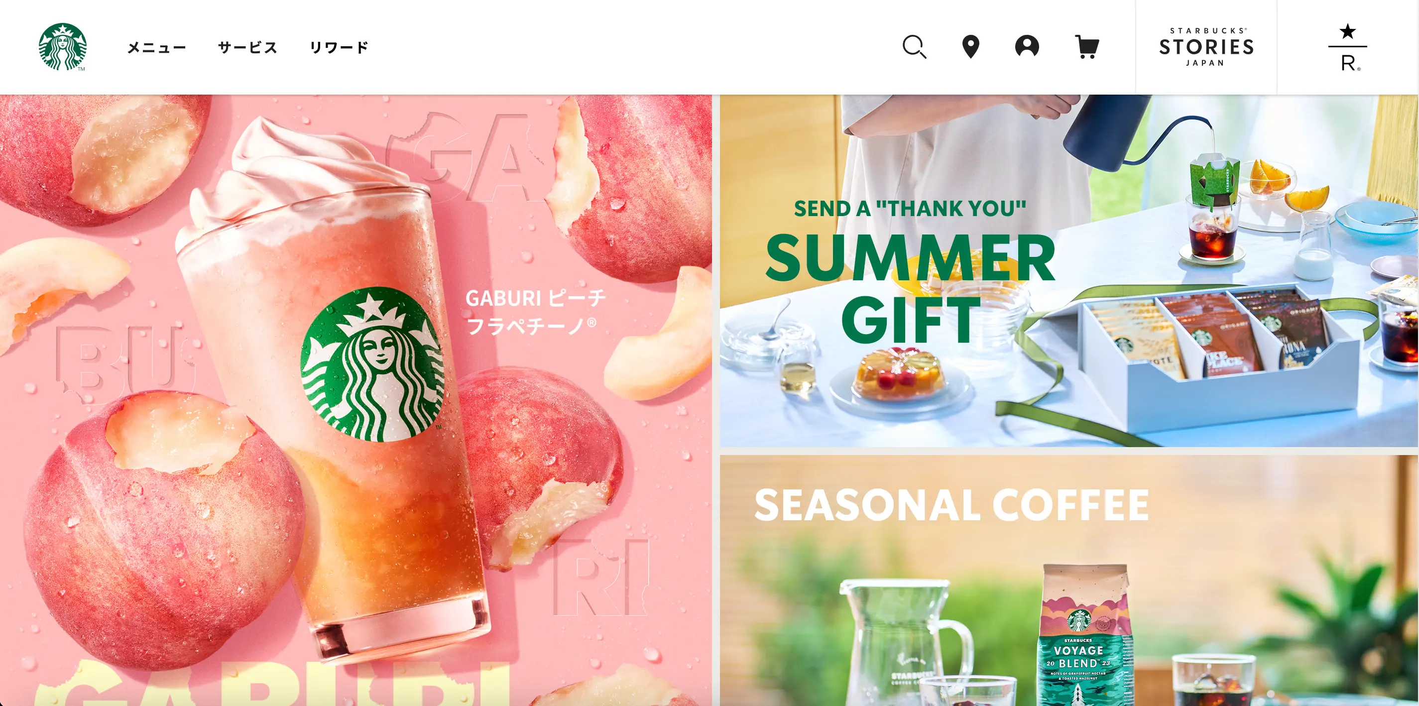
Let’s take another example from Starbucks.
On the US website, clicking ‘MENU’ in the global header allows users to access the entire menu, encouraging them to scroll down and discover the products offered.
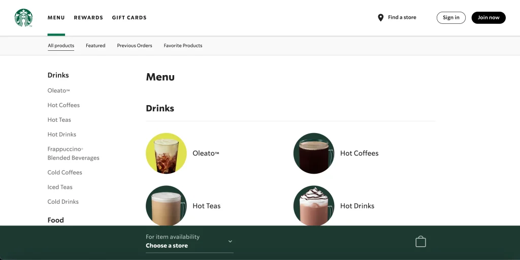
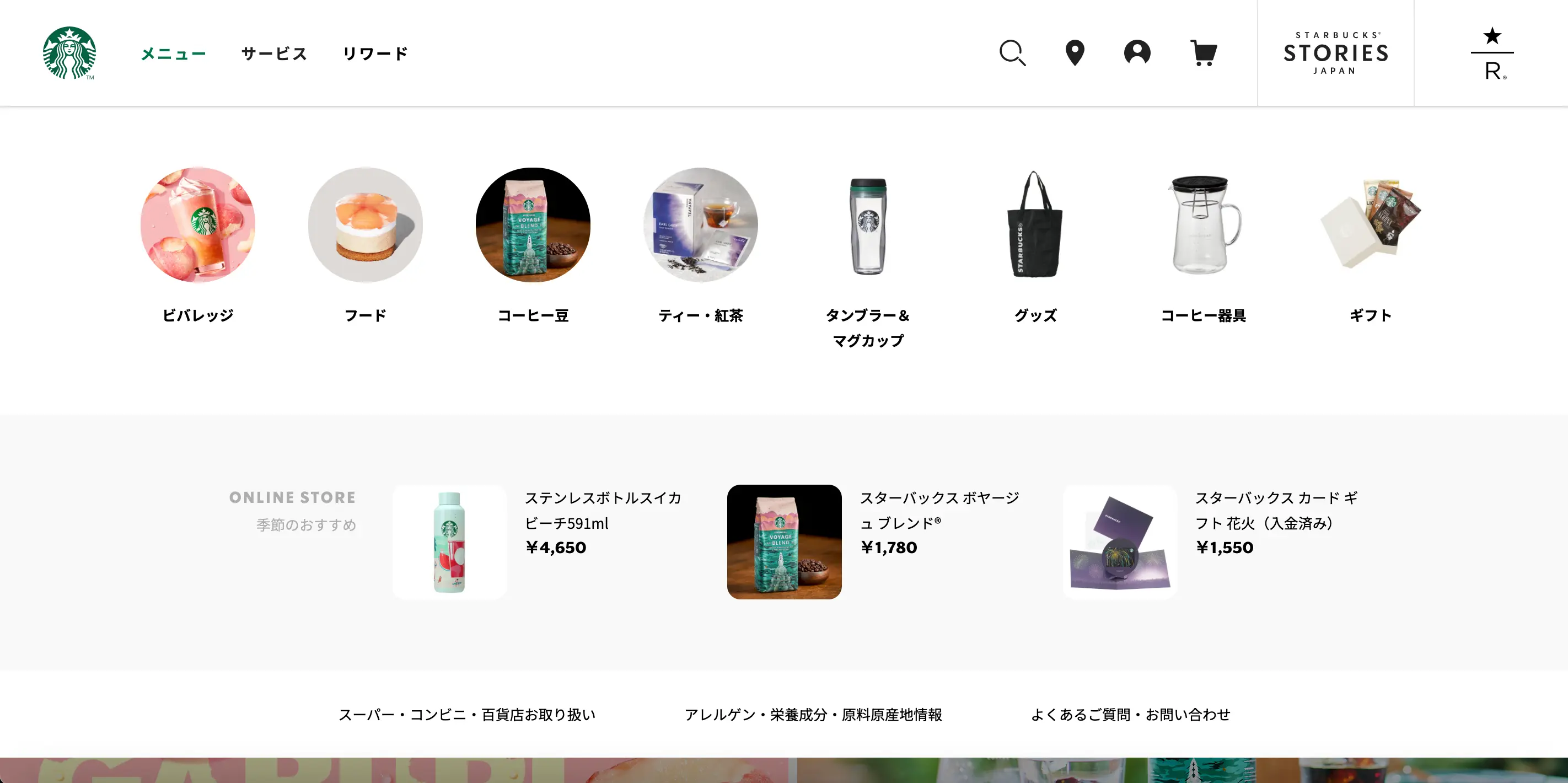
In contrast, the Japanese version of the site simplifies this process. Clicking on the menu tab reveals a dropdown page for each category without the need to load a separate page (see image below). This design caters to the preferences of Japanese users, who often seek quick and detailed overviews. The global menu is structured in a way where users can instantly view all product categories for a thorough product evaluation.
Use of Margins in Japanese Web Design
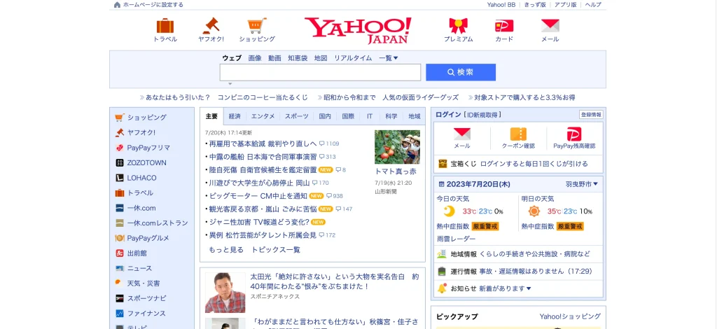
The way margins are utilised significantly varies between international and Japanese web design. To illustrate this contrast, let’s examine both Yahoo! JAPAN and Yahoo! UK websites. Yahoo is the second most popular search engine in Japan, after Google.
Yahoo JAPAN’s website contains all of its information in the centre of the screen, leaving less negative space within the site design. This approach creates a concentrated layout with tightly packed text and images.
|
Please note: Yahoo Japan’s services are not available in the European Economic Area and the UK since 6 April 2022, due to “excessive regulatory burden”. |
In contrast, the UK version of the website features minimal margins on both sides of the screen. The design diverges significantly, partly influenced by differences in character width between Japanese characters and English alphabets.

This design choice is also influenced by the unique reading styles of local audiences. Takahiko Masuda, a researcher at the University of Alberta, conducted a study on how Americans and East Asians process information. According to the research, Japanese individuals tend to have a “holistic pattern of attention”, meaning they absorb information from a broader view range. In contrast, Americans tend to “isolate the central subject from its surroundings” and focus on a single point to process each subject. This might explain why Japanese websites can present more information in a format that allows for quicker comprehension.
Does Image Quality Matter in Japanese Web Design?
Now, let’s delve into the quality of the images used on websites. Many foreign websites opt for high-quality images to create a strong visual impact. Considering Masuda’s earlier research, this approach aligns with the single-point reading style prevalent in Europe and the US. Prioritising large images helps in capturing interest and attention effectively.
On the contrary, Japanese websites place a higher emphasis on loading speed, often employing lower-quality images.
According to Google/SOASTA Research in 2017, more than half of users indicate that they would leave an eCommerce site if it takes longer than three seconds to load. Additionally, research highlights a direct correlation between site display speed and revenue, indicating that faster-loading sites boosts higher conversion rates.
These insights underscore the significance of optimising both text and images to ensure rapid page loading. This Japanese practice aims to provide users with a stress-free and comfortable online experience, prioritising speed over high-quality images.
Use of Colour in Japanese Web Design
The implementation of colours on websites varies between Japan and other countries. Many overseas websites adopt a minimalist design approach, utilising a limited colour palette and a few recurring font styles to create a cohesive and clean appearance.
In contrast, Japanese websites, often with a packed design, may appear overwhelming to those unfamiliar with them. However, Japan has a unique approach to using colours, categorising information with a wide range of colours to aid users in quickly discerning content. The more categories there are, the more colours are employed. Bold and attention-grabbing colour schemes are implemented to engage the user effectively.
For instance, let’s compare the UK and Japanese versions of the Zurich Insurance Company’s website. The Japanese version features a pastel blue colour scheme, evoking a sense of calm and trustworthiness. However, it uses bright red and orange for important buttons, ensuring that crucial information stands out.
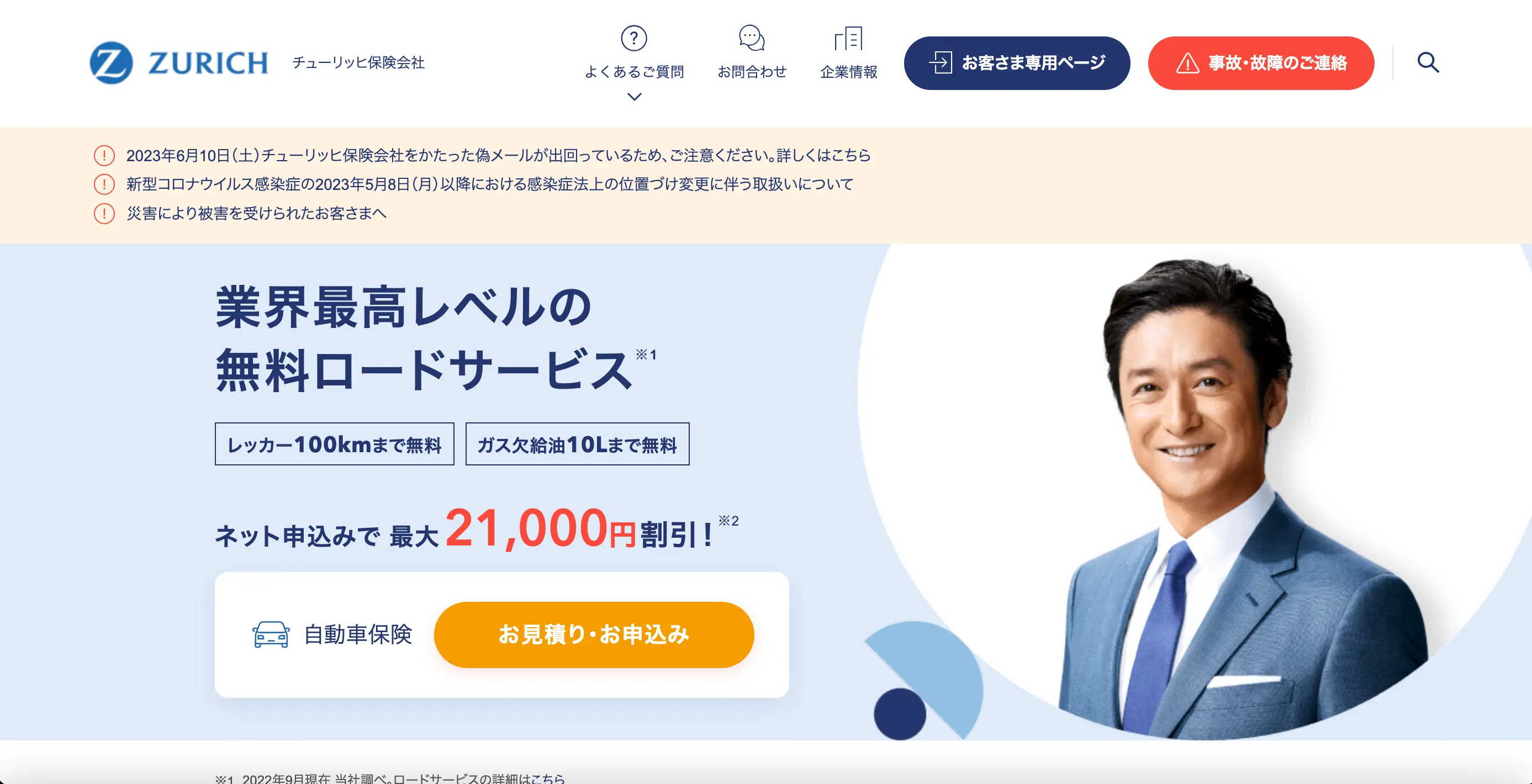
On the other hand, the English version of the website has a darker colour scheme with fewer colours and shorter text descriptions. While the layout of the banner and its accompanying photo remains consistent between the two versions, it is evident that the UK version has opted for a more monochromatic photograph.

Japanese vs. Oversea Design Preferences
Japanese websites frequently employ a distinctive design element of using boxes to compartmentalise and organise information. This design choice is a common layout feature found in many Japanese websites.
For example, take a look at the homepage of kakaku.com, a major price comparison website in Japan. Here, you will notice that information is systematically categorised into boxes, with wide margins on the sides, while the central content remains focused. This layout is intentionally designed to facilitate users in swiftly locating the information they seek, all in one comprehensive view.
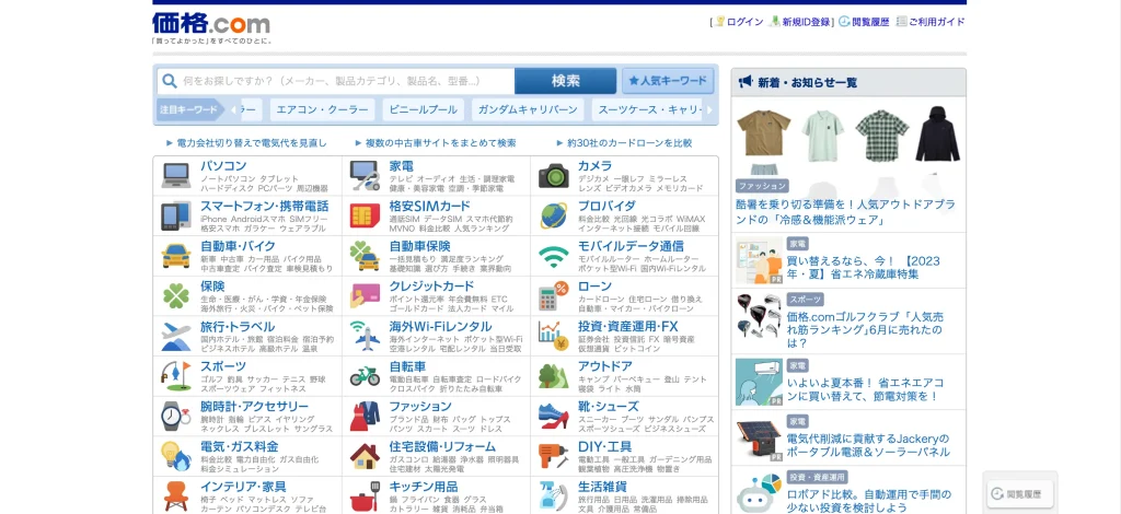
Additionally, there is a noticeable difference in the shape of these boxes, particularly in how the corners are treated. Japanese websites often have boxes with sharp corners, conveying a sense of stability and reliability. In contrast, overseas websites tend to favour designs with large rounded corners, which impart a softer and more approachable impression.
This distinction is evident when comparing the two Yahoo websites we discussed earlier. In the Japanese version, both the topic tabs on the left and the weather information on the right are enclosed in neatly defined squares with sharp corners.

|
Please note: Yahoo Japan’s services are not available in the European Economic Area and the UK since 6 April 2022, due to “excessive regulatory burden”. |
Conversely, in the UK version, the top news section and its accompanying captions are enclosed in squares with rounded corners. Trending articles and the weather information on the right are presented as text paragraphs of varying sizes, without any enclosures. This design choice simplifies the layout, guiding users’ attention directly to the top news articles.

Why Websites Need Localisation
The differences between Japanese and overseas web designs are intricately tailored to align with the aesthetics and preferences of their respective target audiences. Japanese websites, while information-rich, offer layouts that enable users to swiftly absorb a substantial amount of content at a glance. This, however, can become overwhelming for international users, whose preferences often lean towards minimalist designs.
When creating websites for an international audience, localisation is essential requirement. Merely translating the content is not enough to make the website suitable for your intended region. What is imperative is a profound understanding of the market dynamics, coupled with an appreciation of its cultural values. This approach is geared towards crafting a truly user-friendly website.
Conclusion
Using the same website design that works in one country, may not work in another. Without adequate localisation, users may experience discomfort with the design.If you are considering expanding your business internationally, please do not hesitate to contact us for all your web localisation needs. We’re here to help you navigate through the complexities of web design from both a Japanese and global standpoint.
Article: Alina Sai / Hisayoshi Kato
Design: Chihiro Murakami
Share on


CATEGORY LIST
-

Explore our diverse website/app designs and other production achievements.
-

Find articles that matter to you on COOSY BLOG!
Talk to Us, We Listen!
Click here for enquiries about websites and quotations.
Contact us