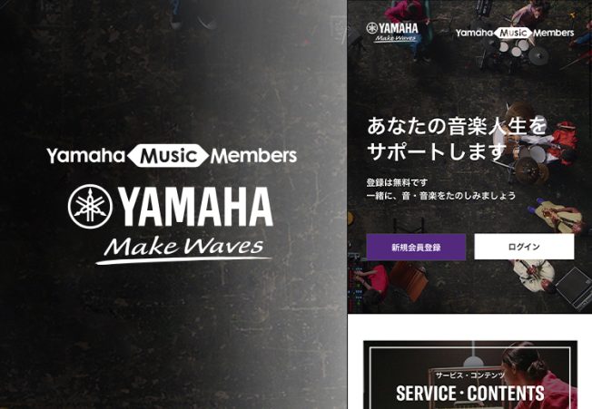
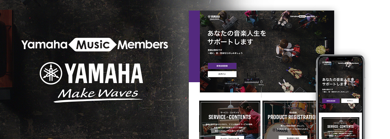
Web Service|Yamaha Music Members
Membership Website Renewal
for All Music Enthusiasts
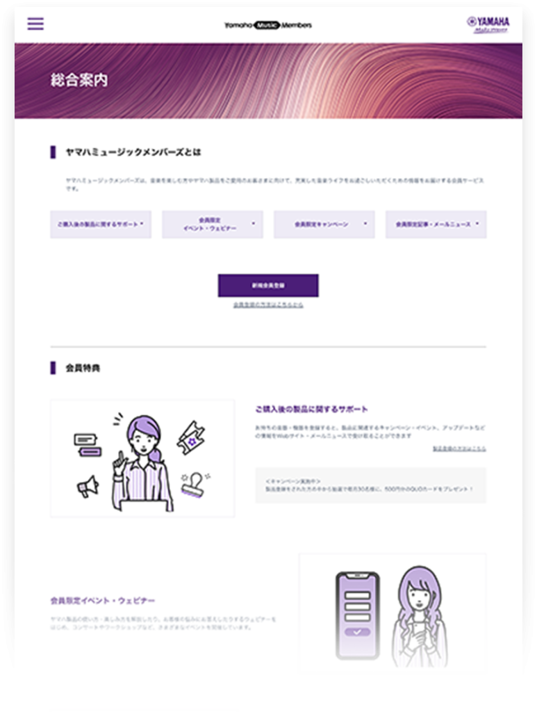
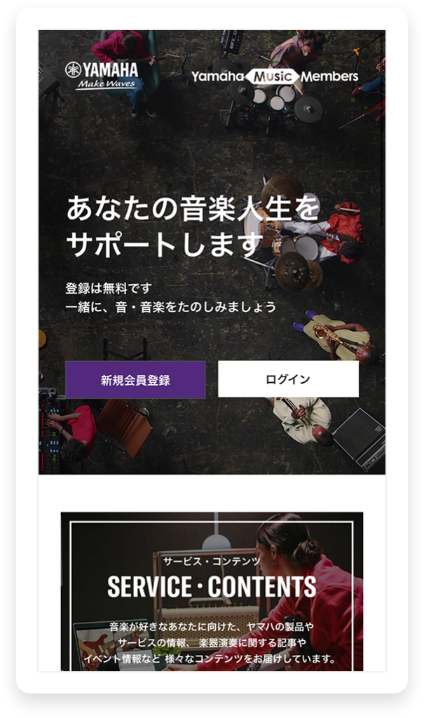
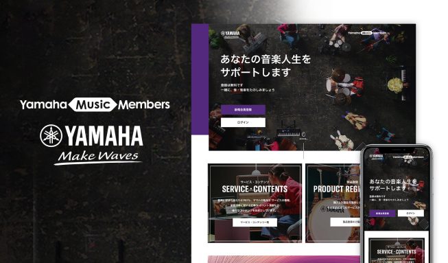
Yamaha Music Japan’s membership website is tailored for music enthusiasts and existing Yamaha customers, providing a diverse range of music x life related information. By implementing new design guidelines during the renewal process, we resolved brand identity and incohesive design dilemmas addressed by our client. The UI/UX design now embodies the Yamaha brand identity, executed on a simplified layout that ensures smooth access for users of all ages.
 Project Timeline and Scope
Exploring the Core Issues for Brand Clarity
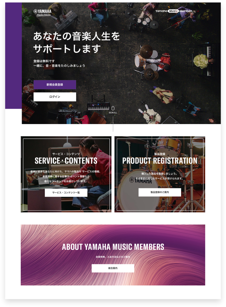
The three-month production period for Yamaha’s website encompassed comprehensive tasks, from redefining the information architecture and implementing UI/UX design, to coding and CMS construction. The website prioritises accessibility for users of all ages, while presenting a layout that embodies the essence of Yamaha’s brand identity. The primary goal was to create a user-friendly design that appeals to a diverse audience of music enthusiasts across all age groups and genders.
Client Dilemma
A Design to Embody their Creative Vision
Prior to the renewal, the website suffered from an inconsistent tone due to the various imagery and content created by separate departments. The client also emphasised their preference of integrating the existing Yamaha’s creative guidelines into the new website.
Throughout the project, our focus was to align Yamaha’s creative guidelines to the new enhanced visual elements, incorporating photographs and illustrations that vividly communicate their brand identity. We also concentrated on establishing a unified format for a cohesive look and feel across the website. Our emphasis on designing with a long-term perspective ensures the sustainability of these designs over an extended period of time.
 Our Design
Yamaha’s Devotion to Reach All Music-Loving Generations
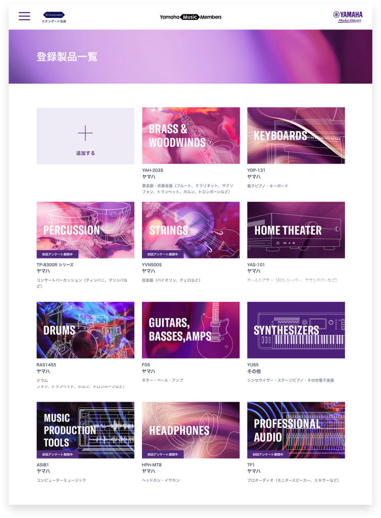
One of our key strengths is identifying areas for improvement. While a complete rebranding wasn’t necessary for this project, we proposed and strategised an approach to address all their requirements. Our goal was to create a user-friendly website that resonate with a wide audience, reflecting their brand identity. Yamaha’s creative guidelines featured prominent photographs and graphics, along with distinctive typographic elements and colour schemes. Taking these into account, our in-house team successfully addressed and polished all of these elements. By implementing a layout with large images, extended typography and graphics aligned with the brand book, we established a neutral site accessible to all.
Overview
Ensuring Design Sustainability Through
Regulated Layouts
To maintain the original design goals and prevent the need for frequent layout adjustments, we implemented few design regulations for the renewed website. These regulations encompass simple design principles and web structural guidelines, along with predefined templates for page titles, headings, and buttons. This preventative measure ensures minimal disruption to the layout when new content is added across various departments. By adhering to these design rules, we guarantee a cohesive design structure of the website even as the content continues to expand.
Recommended Client Portfolios
-
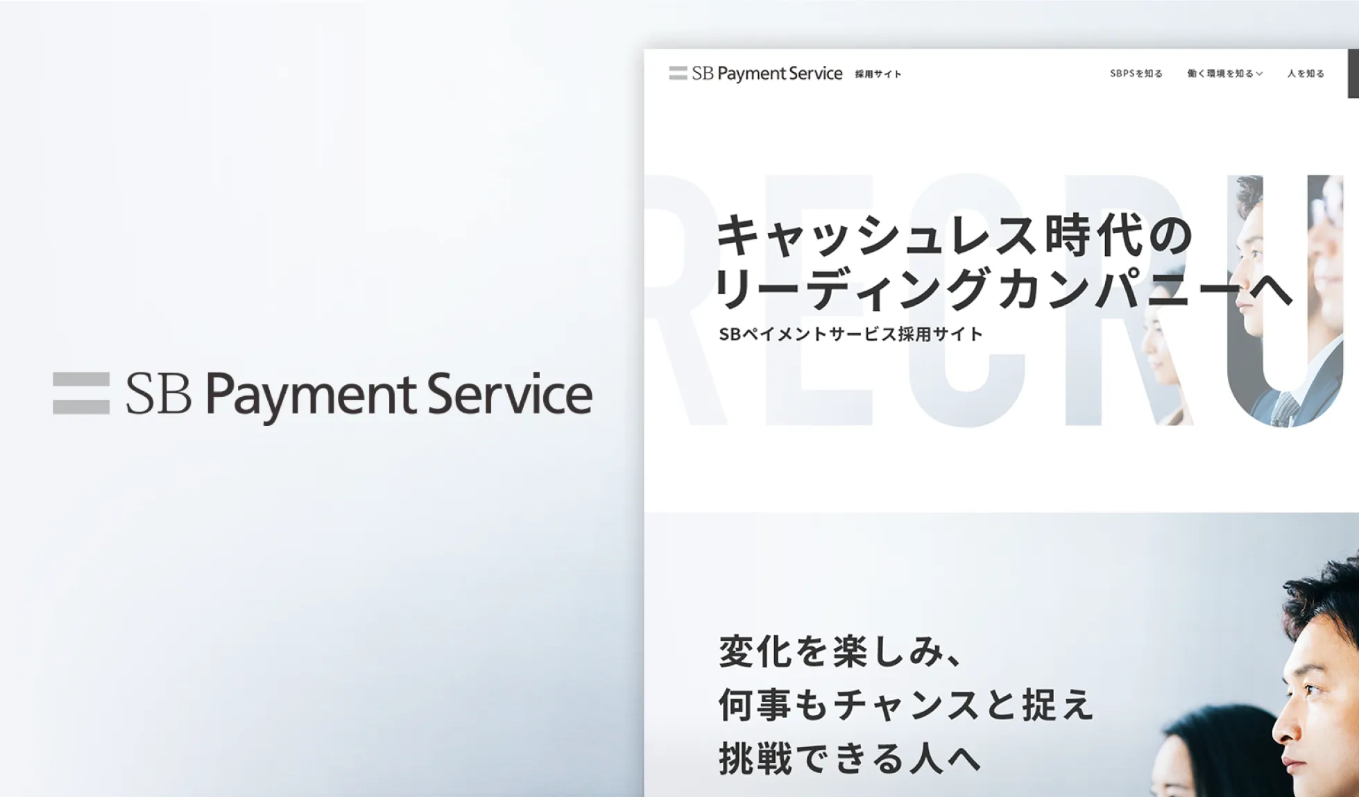
SB Payment Service
Recruitment Website RedesignThis portfolio showcases the redesigned recruitment website for SB Payment Service Corporation, targeting new graduates and mid-career applicants. The design emphasizes impactful scrolling and hover interactions to create a lasting impression.
Read Articles
-
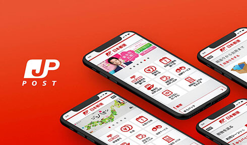
Japan Post’s Delivery Service to All Users
A redesign project for Japan Post's mobile website. Customised pages have been meticulously crafted and launched to cater various user types, aiming to broaden the reach and understanding of Japan Post's delivery services among a wider user base.
Read Articles
-
Membership Website Renewal
for All Music EnthusiastsMembership service website for Yamaha Music Japan. The previous website had a noticeable disconnect with the brand's visual identity, which has now been successfully addressed by establishing and implementing clear design guidelines during the website's redesign.
Read Articles
Talk to Us, We Listen!
Click here for enquiries about websites and quotations.
Contact us