Share on
Decoding the Aesthetics and Cultural Influences in Japanese Web Design
“What distinguishes Japanese web design from the rest of the world?”
This article offers an in-depth exploration of the distinctive qualities of Japanese web design, and its culture, catering to those curious about its unique aspects.
At its core, Japanese web design exemplifies a seamless integration of aesthetics and functionality. This approach melds traditional design with contemporary techniques, infusing elements of minimalism, vibrant colour palettes, and user-focused design to elevate the overall user experience. Central to this style is an inherent Japanese aesthetic that sets them apart from the world.
Throughout this article, we will explore seven defining features of Japanese web design, annotating each aspect with its cultural context. We invite you to join us on this insightful journey through the end of the article.
1. Fusion of Traditional and Modern
Japanese web design is distinguished by its harmonious fusion of traditional and contemporary elements. This approach integrates classical Japanese aesthetics with cutting-edge design trends and technology, building websites that are uniquely Japanese and exceptionally user-friendly.
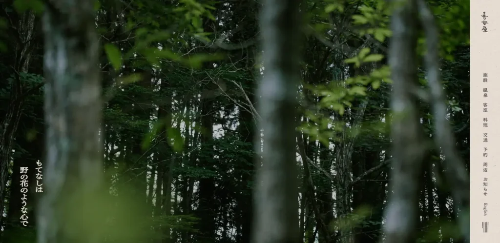
For instance, the website of the mountain inn, Kiyasuya. It showcases an innovative use of vertical text layout, deviating from conventional web design formats. This minimalist approach, which strips away any superfluous elements, subtly conveys the traditional Japanese concept of ‘wabi-sabi’, emphasising beauty in simplicity and impermanence.
2. Minimalistic Design
Japanese web design often embraces minimalism and simplicity, rooted in the belief that true beauty resides in understated elegance. This philosophy prioritises designs that minimise visual clutter and focus on efficient communication of information.
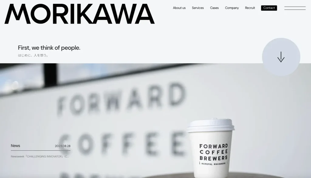
Consider the website of Morikawa Ltd. as an example. The website’s minimal text is complemented by a striking increase in font size for key elements. At first glance, the viewer’s attention is immediately drawn to the boldly displayed word ‘MORIKAWA’, along with a downward scrolling arrow. This intentional design choice guides the viewer’s focus seamlessly, using a clean and straightforward layout to highlight essential areas of interest.
3. Colour Symbolism
The significance of colour and balance is paramount in Japanese web design. Designs frequently integrate traditional Japanese colours and patterns, placing considerable emphasis on harmonious arrangement. In Japan, the symbolism behind each colour is deeply understood, and choosing the right hues is a critical aspect of design.
Consider the color purple. In Japan, it conveys a spectrum of meanings – from elegance and romance to the sacred and exotic. However, it also carries connotations of insecurity, pretentiousness, vanity, and authoritarianism.
This diverse perception of purple might explain its absence in certain corporate identities. A colour scheme analysis of the four largest banks in Japan reveals a notable exclusion: none have chosen purple as their corporate colour.
- Mitsubishi UFJ Financial Group: Red
- Sumitomo Mitsui Financial Group: Green
- Japan Post Bank: Green
- Mizuho Financial Group: Blue
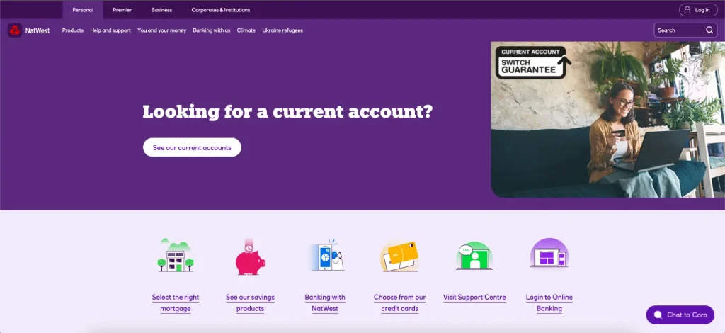
In contrast to Japan, where purple is noticeably absent in banking, this colour finds prominence in international banking sectors.
For instance, NatWest, a major UK bank, which has adopted bright purple as its brand colour. In the UK, purple is often linked with royalty and generally is perceived positively by the public. This favourable view is partly rooted in history, where purple dyes, once rare and highly expensive add to the colour’s regal and luxurious connotations.
4. Text-Heavy Design
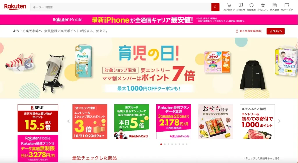
Japanese web design often prioritises textual content, reflecting the information-driven nature of customers. This emphasis extends to meticulous font selection and text arrangement, where both readability and aesthetic appeal are considered essential. This approach is especially evident in e-commerce platforms.
Consider the website of Rakuten Ichiba, a leading Japanese e-commerce mall. Despite its dense textual content, the website remains remarkably readable. This is achieved through thoughtful design choices.
For instance, numerical indicators such as ‘3x’ and ‘5x’ are made to stand out through distinct colouring, enlarged size, and strong contrast. Similarly, promotional phrases like ‘Childcare Day!’ are creatively presented using playful fonts that evoke a child-like charm and are colourfully rendered for added appeal.
5. Seasonality
Japan is a land of four distinct seasons, each marked by numerous seasonal events and celebrations. Beyond traditional observances like New Year, Christmas, and Obon, Halloween has recently gained popularity, partly fueled by theme park promotions. Reflecting these seasonal themes, products and services, including website designs, often undergo seasonal updates.
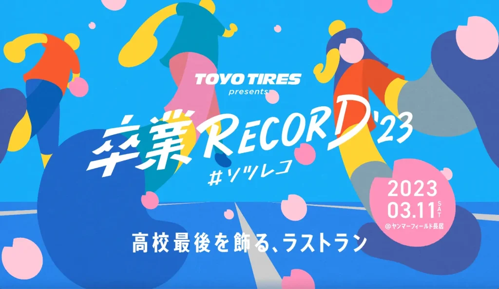
Take, for instance, the event website for ‘Graduation RECORD ’23’. Its design predominantly features a blue palette, yet it is subtly adorned with cherry blossom petal motifs. This design choice unmistakably signifies its association with spring, even without explicit textual indications. Note, that graduation season in Japan happens in March, when cherry blossoms are in full bloom. Hence, the absence of these cherry blossom elements would noticeably diminish the seasonal feel. Incorporating such seasonal and event-specific elements into the design effectively evokes a sense of the season.
6. ‘Kawaii’ Characters
In Japan, employing characters as a key component of corporate marketing strategies is a prevalent practice. This approach, known as ‘character strategy,’ involves anthropomorphising inanimate objects to create a sense of familiarity.
This practice extends into various cultural expressions, including anime, where objects like Japanese swords, old Imperial Japanese Navy battleships, and even racehorses are given human-like attributes. This could be considered a traditional art form and is deeply ingrained in Japanese culture. Unsurprisingly, this trend has seamlessly integrated into web design as well.
A prime example is Nissin Cup Noodles’ innovative campaign. They transformed the lid of their Cup Noodles into a cat character named “Cup Meowoodles.” This campaign is interactive and engaging:
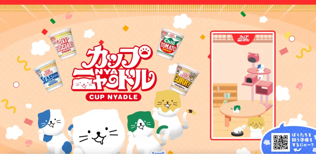
Meowdle, the cat, resides behind the Cup Noodle lid, eagerly waiting to be discovered by consumers. When a customer scans the 2D barcode on the lid's front and photographs Meowdle's face on the back, the character springs to life on their smartphone. This clever integration of product and character not only makes the lid relatable but also facilitates natural communication with consumers.
引用元
https://cup-nyadle.com/
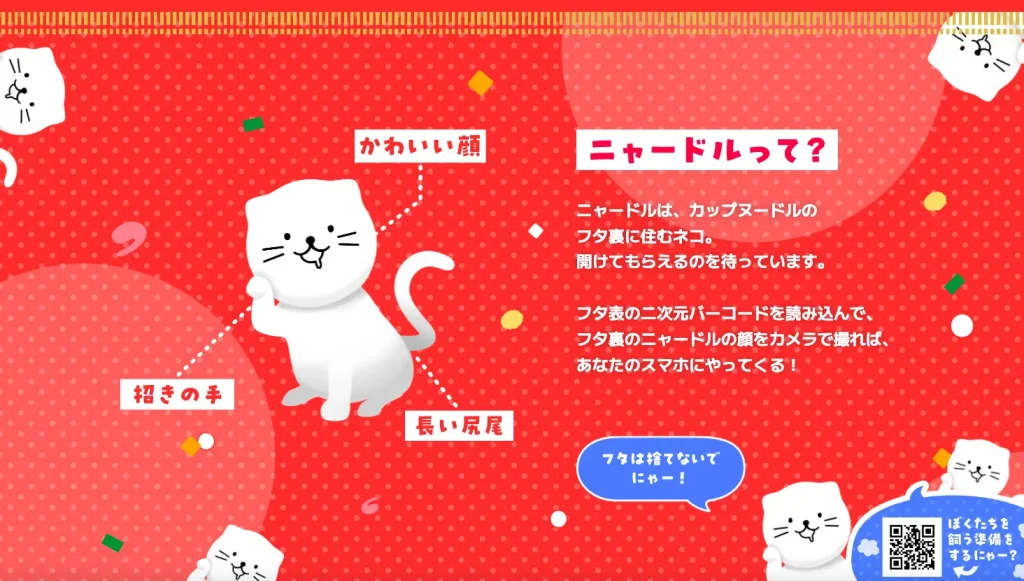
By turning the product’s lid into a character, the campaign creates a familiar and interactive experience, enhancing consumer engagement.
7. User-Centric Design
Japanese web design is fundamentally user-centric, placing a high priority on user feedback to facilitate continuous improvements. In recent years, this trend toward user-centered design has become more pronounced. This shift may partly be driven by the recent legal requirement to accommodate various users for web accessibility.
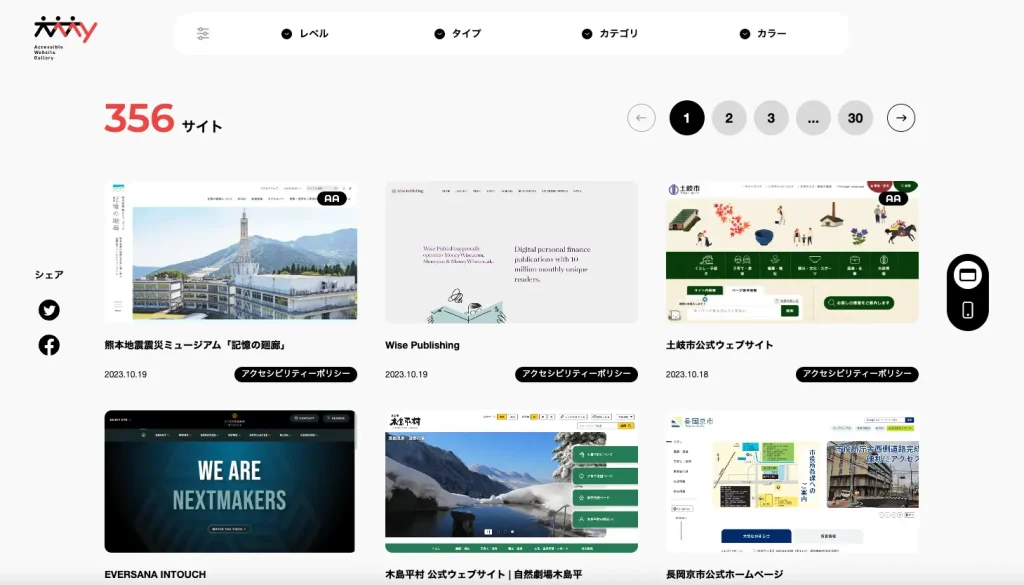
One notable initiative reflecting this commitment is the Accessible Website Gallery. This gallery showcases websites specifically designed with web accessibility in mind. The growing number of such websites inherently supports the principles of user-centred design.
Here is an article which provides a clear and concise overview of what web accessibility is!
Conclusion
The interplay of aesthetics and functionality stands out as a defining trait of Japanese web design. This unique approach, blending enhanced user experience with visual elegance, continues to garner global interest.
For businesses looking to establish a presence in Japan, we hope this article helps share new insights, to serve as valuable reference points.
Article: Alina Sai / Hisayoshi Kato
Design: Ayaka Shimokawa
Share on


CATEGORY LIST
-

Explore our diverse website/app designs and other production achievements.
-

Find articles that matter to you on COOSY BLOG!
Talk to Us, We Listen!
Click here for enquiries about websites and quotations.
Contact us