Analysing Design Trends of the Top Four E-Commerce Malls in the World!
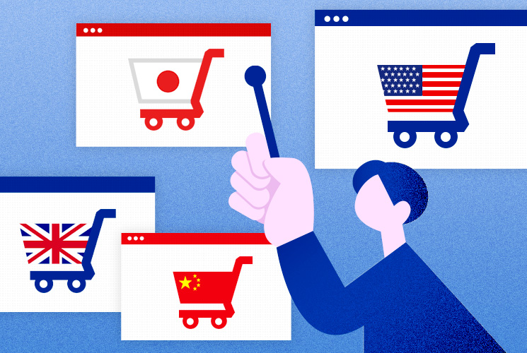
The global e-commerce market has been experiencing consistent growth every year. According to the 2022 report from the Ministry of Economy, Trade, and Industry, China dominates as the largest business-to-consumer (B2C) e-commerce market globally, with the United States ranking second. Following closely are the United Kingdom and Japan. Collectively, these four nations represent about 75% of the global market, with China’s share standing at an impressive 50%.
However, when it comes to the most frequented e-commerce platforms, there is a noticeable variation across these countries. The preferred e-commerce sites, particularly the online shopping malls widely used by the majority, differ significantly. These preferences appear to be influenced by various country-specific factors.
This article delves into the factors contributing to the rise of e-commerce malls, concentrating on the countries with the largest B2C (Business-to-Consumer) e-commerce markets.
- China: Alibaba
- USA: e-Bay
- Japan: Rakuten Ichiba
- UK: Amazon
|
*While Amazon leads in the USA, similar to its position in the UK, this analysis will shift its focus to eBay, the second-largest player in the US market, to provide a diverse perspective. |
Japan: Rakuten Ichiba
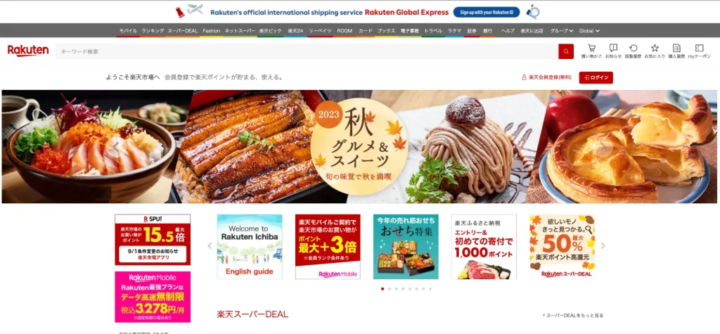
Rakuten, originating from Japan, is a colossal e-commerce and internet services enterprise. The company runs prominent online platforms, including Rakuten Ichiba, and has established itself as a successful multinational corporation, providing a diverse array of services.
Rakuten’s Appeal: Easy-to-Accumulate Points Program
Statista‘s research highlights the primary factors driving brand loyalty on Japanese e-commerce sites. Leading the list are ‘competitive pricing’ and ‘rewarding loyalty point schemes’.
The factors influencing consumer preference include:
- Affordable pricing
- User-friendly product discovery
- Swift delivery
- Points and additional perks
Rakuten, in particular, offers an enticing points program. Under specific conditions, these points can multiply significantly and are effortlessly accumulated. I often find myself surprised, thinking, ‘Wow, I’ve saved this much already!’ as well.
The vast selection of stores and competitive pricing often result in deals better than those found in physical stores. Rakuten’s points extend beyond shopping; they can be redeemed for travel and other services the company offers.
The Rakuten card, used by many for both online and offline purchases, enhances this experience, as points can be earned and redeemed at physical stores. This seamless integration of points with their e-commerce elevates the shopping experience, making it more enjoyable and rewarding for the users.
Design analysis
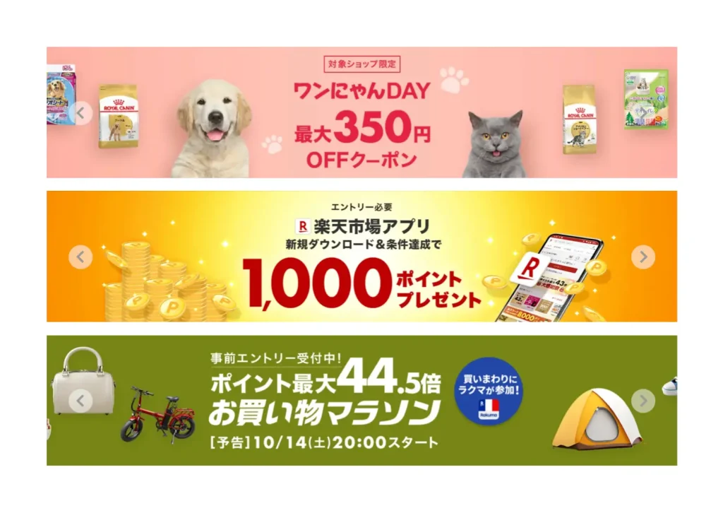
The design of promotional advertisements and coupons is strikingly eye-catching. Horizontal banners, with phrases like ‘Shopping Marathon’ or ‘Coupons Available’, captivate users’ attention. Banners like these add to the effect of creating a bustling market-like atmosphere.
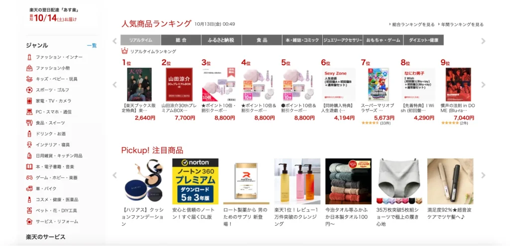
On the website, red is strategically utilised as an accent colour to emphasise crucial information. Additionally, displaying products in a ranked format proves to be an effective method for drawing user interest.
A Page Just for Your Store.
On Rakuten, sellers can build a dedicated page for each of their stores. Below is an example of a store called, ‘after-end’. It is famous for its minimally designed page hosted on the Rakuten Ichiba website.
Given the vast number of stores in the Rakuten Market, it’s essential to adopt a design strategy that makes a store’s identity both intuitive and easily comprehensible to visitors.

China: Alibaba.com
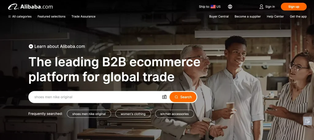
Alibaba, founded by Jack Ma, stands as one of the world’s most prominent e-commerce platforms, originating from China.
Alibaba’s Unbeatably Low Prices
Alibaba is renowned for its exceptionally low-priced offerings. It features an extensive range of products across various genres at prices that are strikingly lower than those typically seen on Japanese e-commerce platforms. Items boasting competitive pricing are particularly attractive and sought after by Chinese consumers.
A search for ‘handbags’ on Alibaba revealed that the majority were priced below £3. However, this astonishing affordability raises concerns about product quality. With lower prices comes lower quality, sellers must engage in fierce price competition while striving to maintain quality standards.
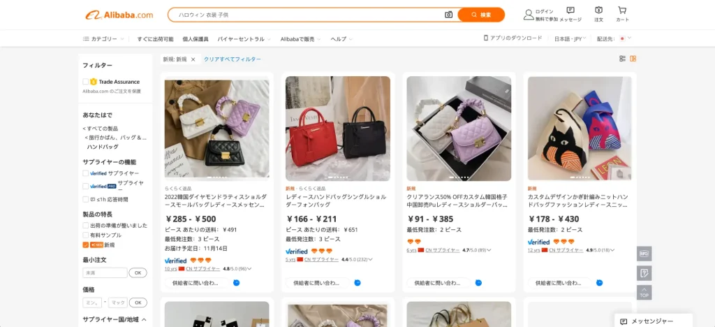
Chinese consumers benefit from the convenience of Alipay, a local payment system, which ensures secure and effortless transactions. Services like next-day delivery align well with consumer expectations, enhancing the overall shopping experience.
Simplified Design
On the Alibaba website, product categories are neatly displayed on the left side of the webpage, accompanied by square product images arranged systematically. Each product listing includes comprehensive details such as return policy, price range, minimum order quantity, and a five-point rating system. This wealth of information offers users a swift and clear overview, helping them easily identify products within their desired price range.
The website’s design is characterised by its simplicity and a white-based colour scheme. The orange search button and the logo provide a striking visual contrast, enhancing the site’s textual content.
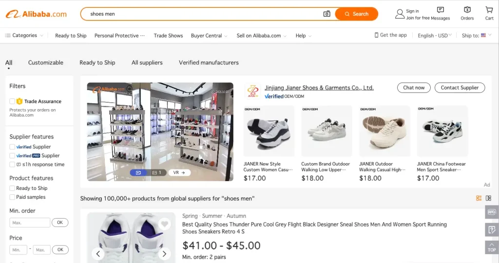
The platform is also multilingual, catering to a global audience.

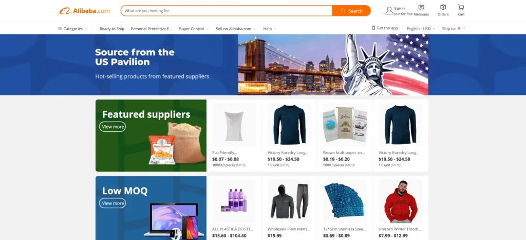
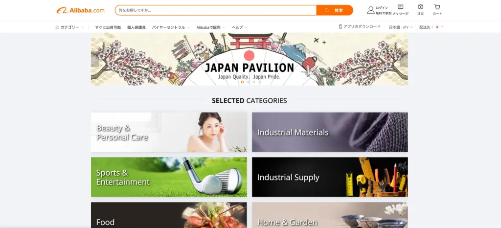
Alibaba has developed several country-specific website pages. For instance, the US version is structured to showcase products immediately, featuring a banner adorned with the US flag and symbols reflecting American culture.
In contrast, the Japanese version of the website incorporates illustrations evocative of Japan in its banners. Products are neatly categorised and are hidden away behind the overview pages.
USA: eBay
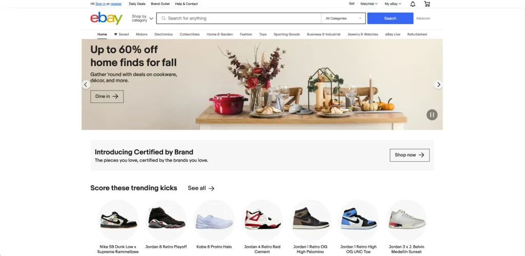
eBay, an American multinational e-commerce platform, specialises in online auctions and shopping. It serves as a global marketplace where individuals and businesses worldwide can buy and sell a vast array of goods.
eBay’s Secret to It’s Popularity
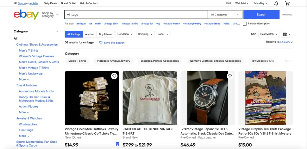
Distinct from numerous e-commerce platforms, eBay adopts an online auction format.
Recently, vintage items have gained popularity in Japan.
However, in the USA, a deeply ingrained collector culture exists, and eBay has long been a preferred destination for acquiring vintage pieces. Additionally, the American ethos places a high value on possessing unique items, making eBay’s auction format ideally suited to this cultural preference.
Retro Grid Design
At first glance, eBay’s interface appears quite ordinary, featuring a search bar and various categories, but with a nostalgic charm.
Design elements typical of the 90s, such as grid layouts and text encased in sharp-edged squares, are still evident in modern eBay page designs. These elements likely contribute to its nostalgic appeal.
UK: Amazon.com
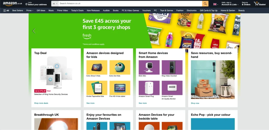
Amazon, with its origins in the USA, has become the most popular e-commerce platform in the UK. In 2022, it secured the top position in Statista‘s UK online shop sales rankings, outperforming its closest competitor, Sainsbury’s—a leading supermarket chain—by more than double.
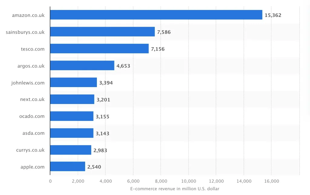
Top online stores in the United Kingdom in 2022, by e-commerce net sales
引用元
Statista
Why is Amazon at the Top?
In the UK, Amazon stands unrivalled in the e-commerce sector. The runners-up in the UK online shop sales rankings are primarily major supermarkets with their e-commerce platforms. This positioning underscores the significant role Amazon plays in fulfilling the demand for online shopping in the region.
Amazon’s extensive selection of products and services, coupled with its reputation for a customer-friendly returns policy and robust customer support, has significantly bolstered its credibility among consumers.
Sleek and Accessible Design
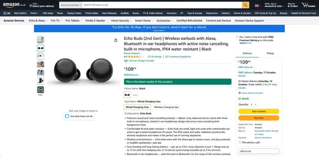
Amazon’s website boasts a sophisticated and user-friendly design. The homepage efficiently presents all essential information, including product categories, a login button, recommended products, and its promotional content.
The typography is strategically varied in size to signify the importance of different text elements, as well as the colour palette, ensuring readability. It features vibrant colours which are balanced harmoniously with the website’s overall background, creating a visually pleasing and intuitive user experience.
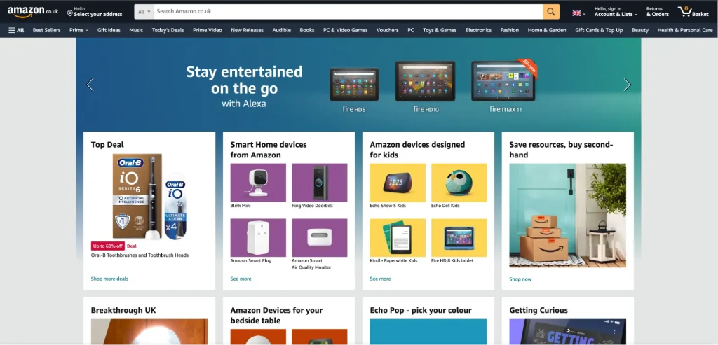
From the main page, users can effortlessly choose their preferred product category or input the product name in the search bar.
Consistent visuals and crisp images facilitate easy navigation for users seeking specific products.
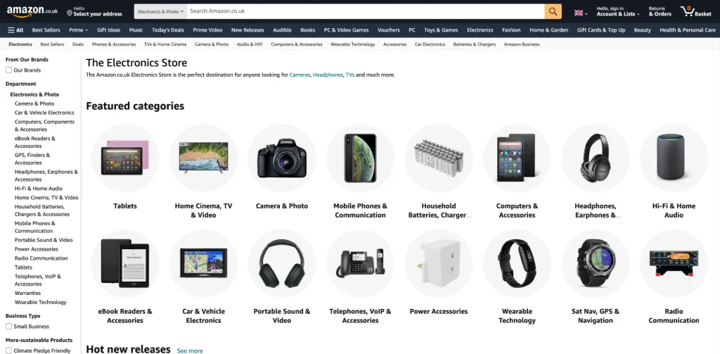
The ‘Add to Basket’ and ‘Buy Now’ buttons are prominently displayed in vivid yellow and orange, drawing immediate attention.
Conclusion
These platforms represent some of the most prominent e-commerce sites in China, the USA, the UK, and Japan, which are among the world’s largest e-commerce markets.
Analysing the design and sales strategies of these websites provides valuable insights into the preferences of users in these countries. It is therefore crucial to carefully examine these successful competitors for guidance and inspiration when developing an e-commerce site.
Article: Alina Sai / Hisayoshi Kato
Design: Saya Kobayashi
CATEGORY LIST
-

Explore our diverse website/app designs and other production achievements.
-

Find articles that matter to you on COOSY BLOG!
Talk to Us, We Listen!
Click here for enquiries about websites and quotations.
Contact us


